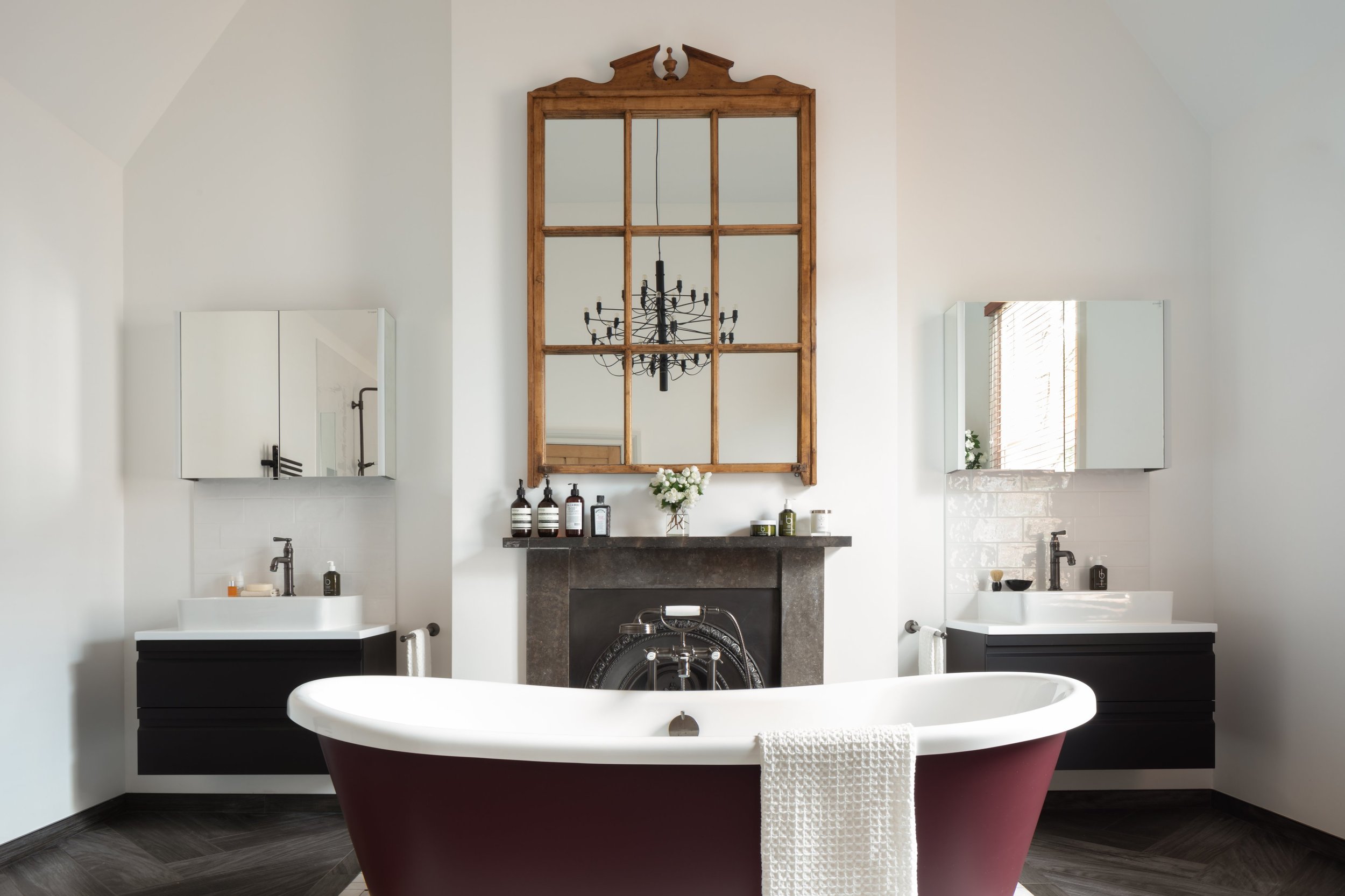
Case study: Influencer Emma Thatcher’s modern monochrome master bathroom
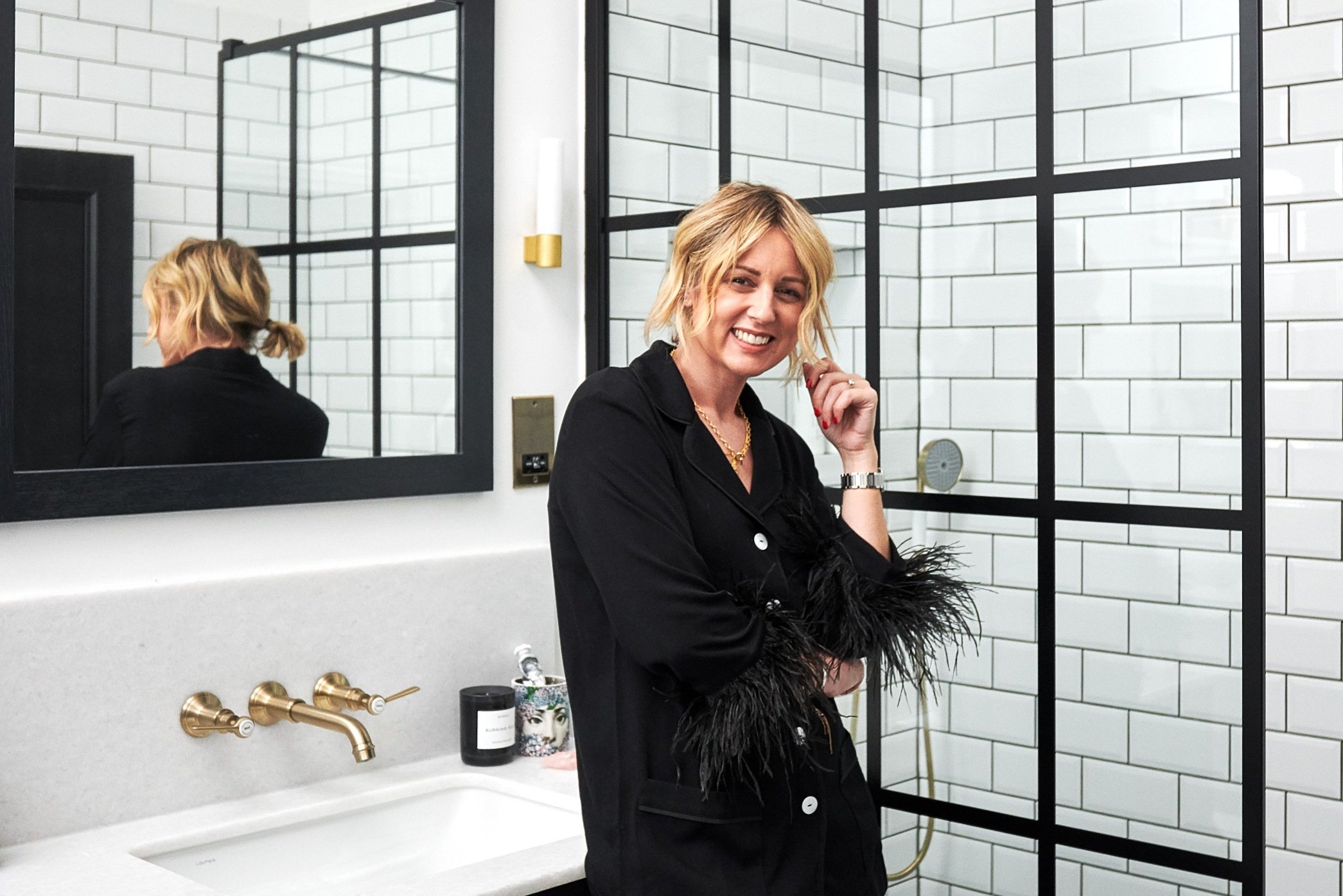
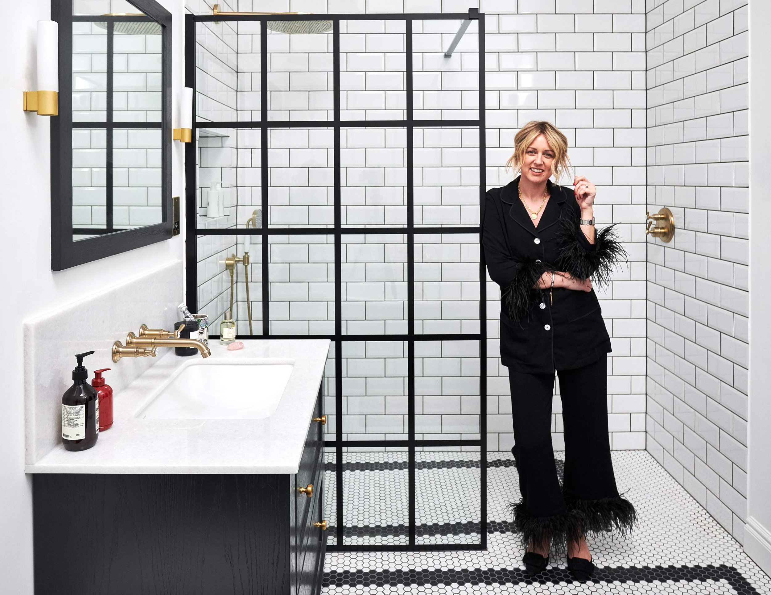
We worked with influencer and fashion stylist Emma Thatcher (@emmarosethatcher) to create an envy-inducing monochrome master bathroom.
Working with a completely blank space in Emma’s recently restored Surrey coachhouse, Jo, Senior Designer from Ripples London, set about creating a bathroom that blended the traditional and contemporary, drawing inspiration from some of Emma’s favourite boutique hotels.
A layout to love
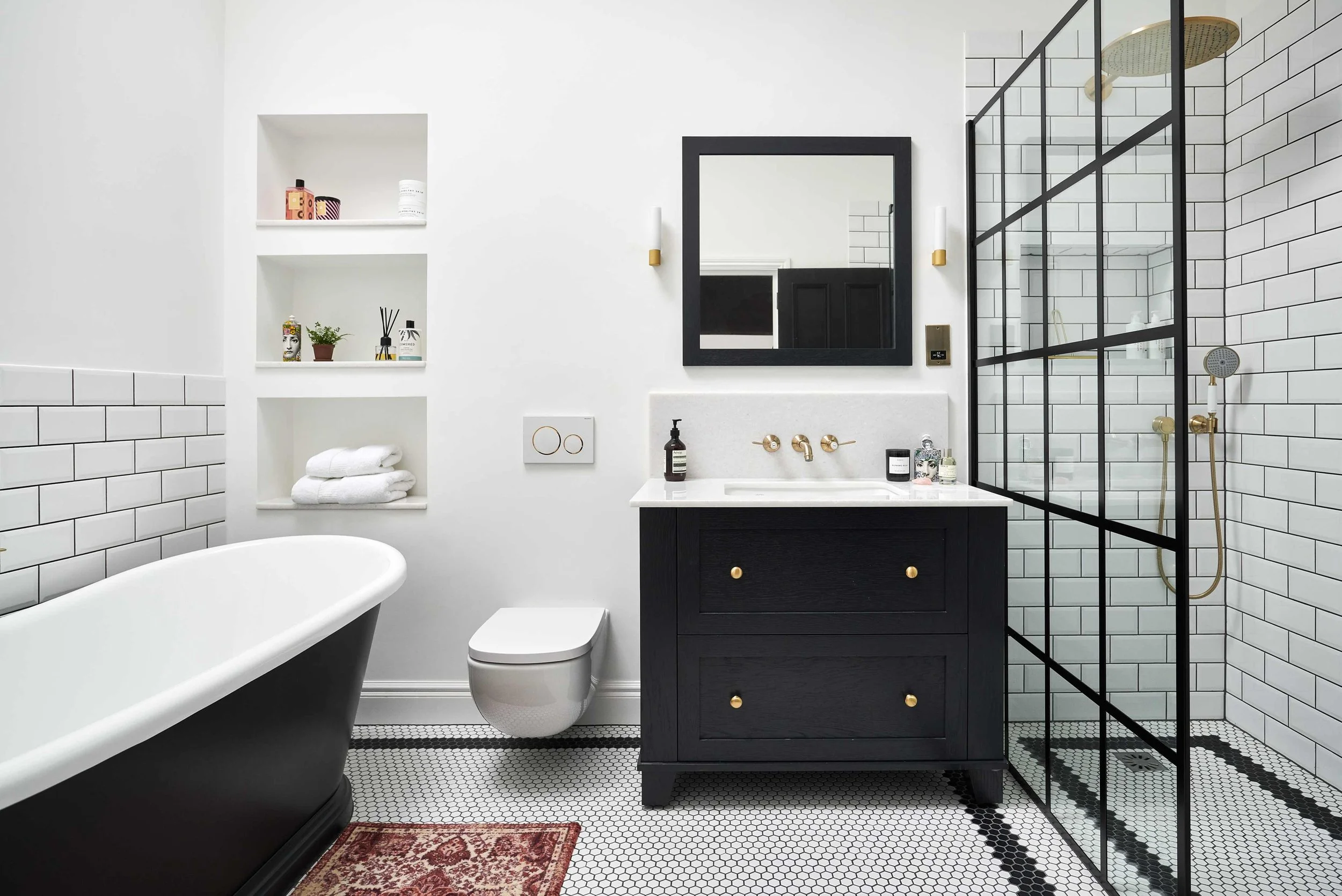
Emma had a clear vision of the style that she wanted to create in her master en-suite and as the space was a clean slate, the layout came together quickly, led by the viewpoints across the room. By utilising two opposite sides of the bathroom, Jo was able to create clearly defined zones: one with a shower for re-energising in the morning and the other with a bath for relaxing in the evening.
Shower space
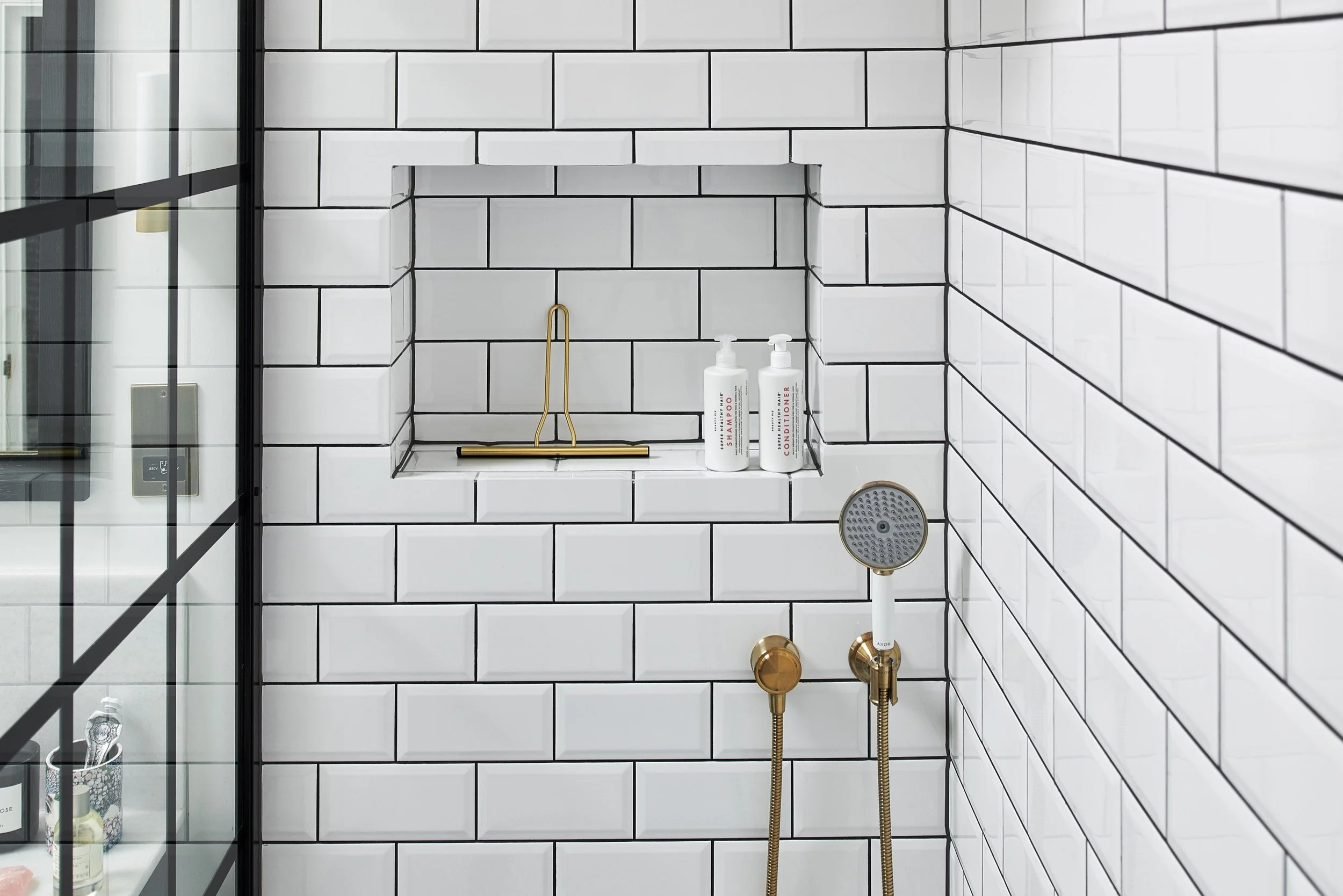
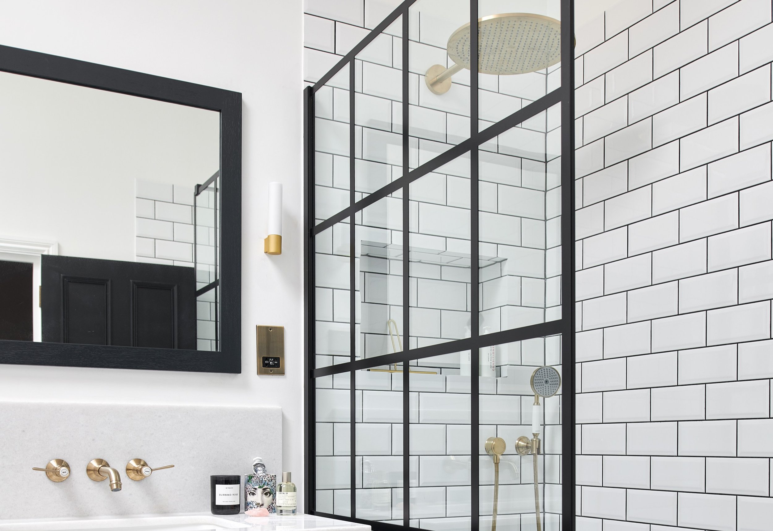
Designer Jo utilised the full width of the room for Emma’s hotel-inspired walk-in shower, extending the playful penny tiles into the shower floor to create the illusion of a larger room. The on-trend Crittall style shower glass not only sections the room, but reduces water splashes in the rest of the space. Emma chose a huge rainfall head fit for a spa and Jo added a separate handshower to match. The contrast of black, metal and glass is striking, especially when paired with brushed brass touches, including the shower, taps and even the shower squeegee.
“We built the wall all the way across to keep the lines clean and simple. We also used minimal tiling, with just the shower walls and half height behind the bath being tiled in a bevelled white gloss brick tile. This helped keep the design simple and sleek, allowing Emma to have fun with the styling, adding on- trend accessories and pops of colour through textiles.”
- Senior Designer, Jo
The main event
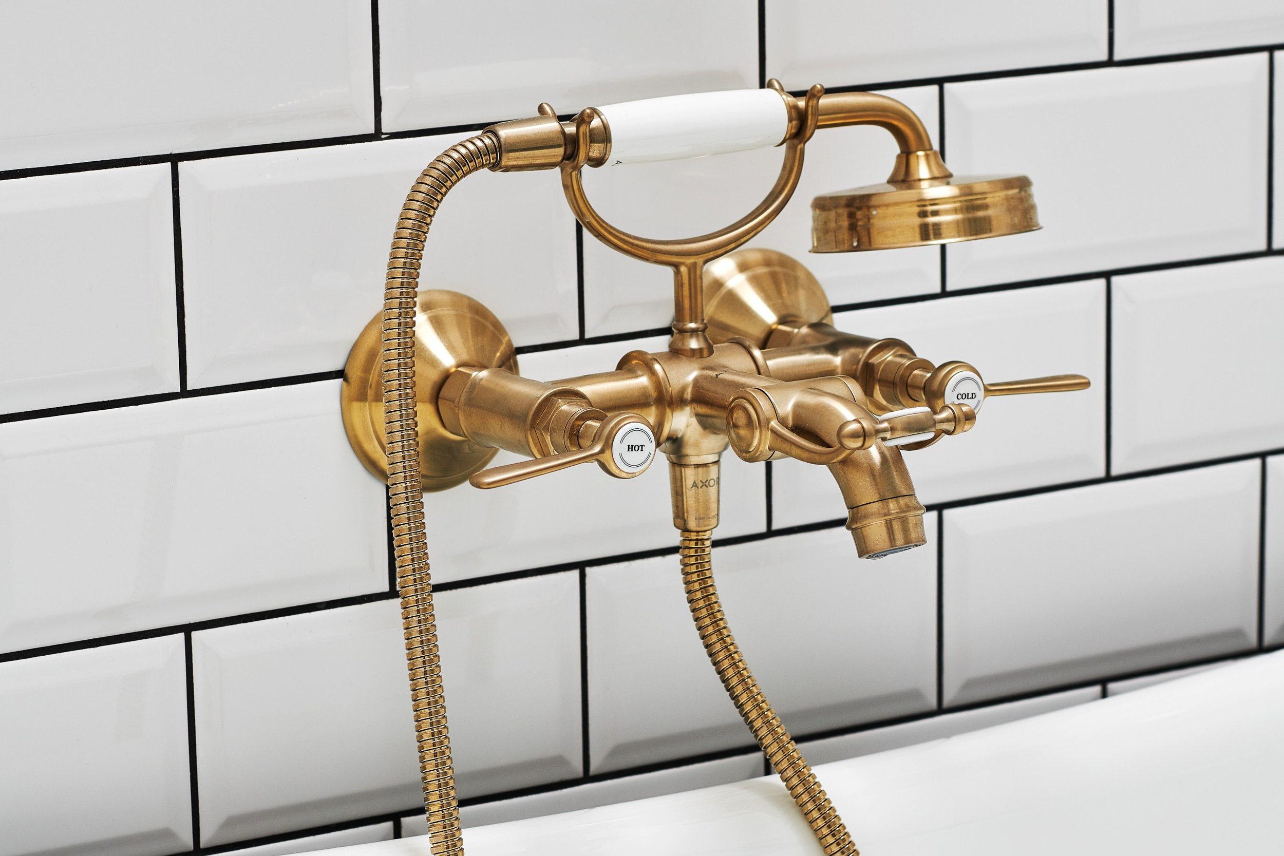
At the other end of the room sits the inviting roll-top bath with its stark white inner and black painted outer. Positioned against the backdrop of a simple white metro tile, the bath is the dramatic centrepiece of the room and is completed with a brushed brass bath filler and hand shower, which perfectly match the brassware used throughout the rest of the room.
“I love the combination of traditional and modern with a stylish, sleek design that will stand the test of time.”
- Emma Thatcher, Client
Subtle storage solutions
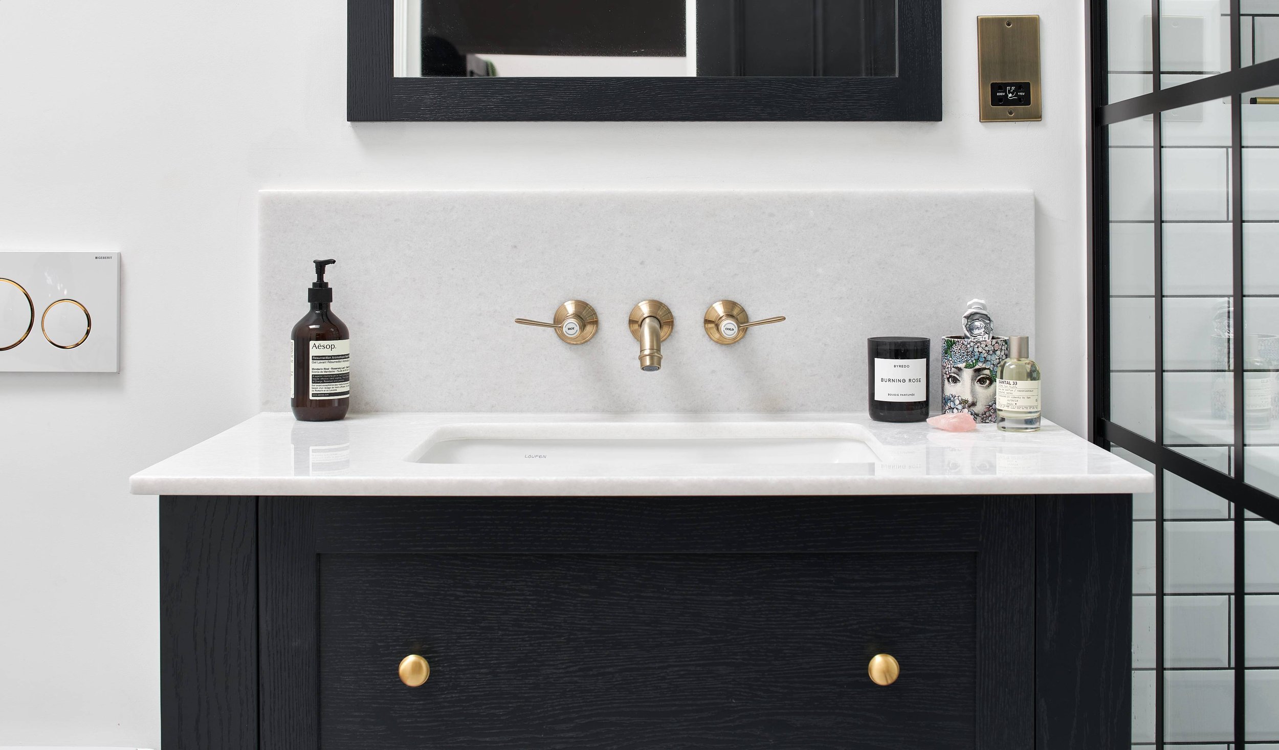
Emma was keen to incorporate lots of storage within her new bathroom and wanted to keep the overall look as sleek and minimal as possible. Jo worked recessed alcoves into the bath and shower areas to display candles, diffusers and plants, whilst hidden storage comes in abundance with the deep drawers underneath the vanity unit. This bespoke Shaker style furniture neatly stows away bathroom essentials and has been painted in the same Farrow & Ball shade as the bath and mirror to tie the scheme together.
Finishing touches
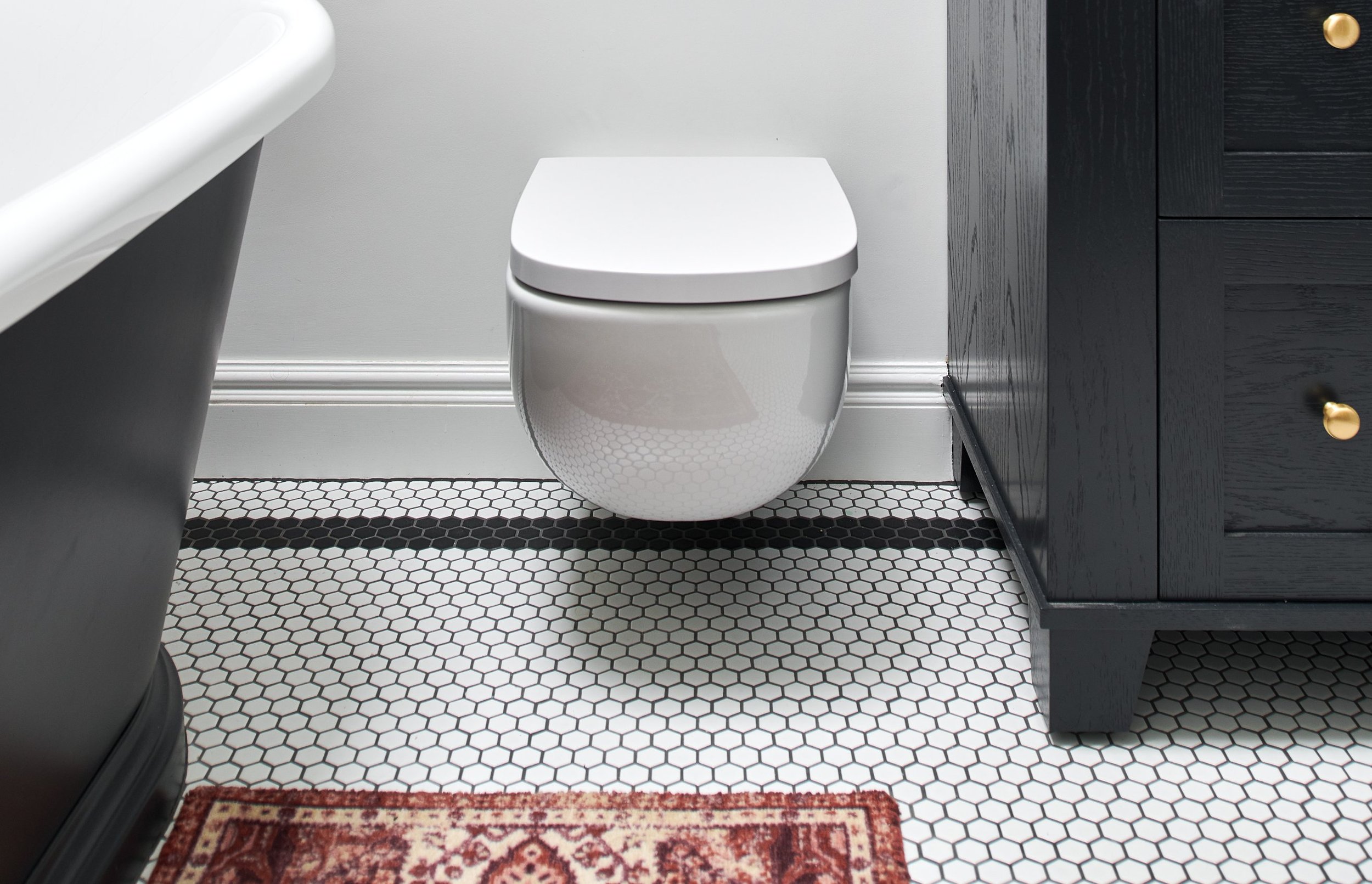
The devil was in the detail when it came to finishing this bathroom and subtle touches like the dark grout colour and matching brushed brass lights add real flair to the space. When paired with simple white painted walls and a modern wall-hung WC, the space sings.
The details
Location: North London
Designer: Jo, Ripples London
Price: from £30k (not including installation)
Products: Freestanding rolltop bath, wall mounted bath filler with lever in brushed brass finish, Crittall style shower panel, single jet hand-shower in brushed brass finish, hexagonal matt white porcelain mosaic tiles, wall hung WC with soft close seat and bespoke made to measure Shaker style painted furniture.
For advice, tips and tricks from our team of specialist bathroom designers, download or request a copy of our free Style Guide.
This bathroom offers a ‘wow’ space which suited the surroundings of the rest of the property.

