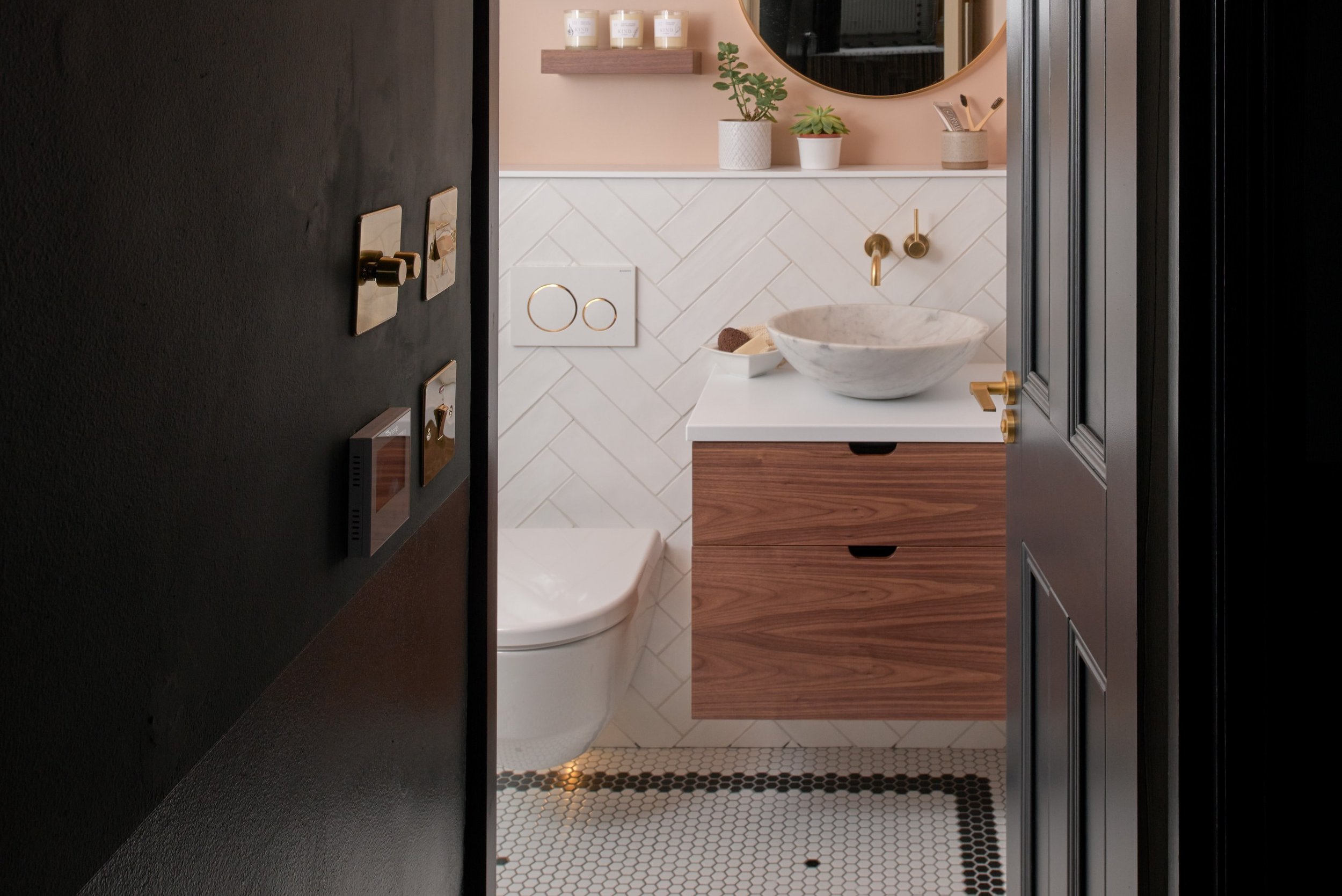
Case study: Contemporary white and grey bathroom with herringbone metro tiles
Style and storage were the two buzzwords for influencer and vlogger Lily Pebbles (@lilypebbles) new Ripples bathroom.
Whilst her existing bathroom was in good working order, the layout didn’t work make the most of the available space, with a large freestanding bath which dominated the room and basin unit so wide it spanned an entire wall. Lily came to Ripples London in search of a streamlined design filled with clever storage solutions and practical products, a challenge Senior Designer Jo rose to.
Reworking the layout
When designing Lily’s new bathroom, Jo began by completely reworking the layout to make better use of the space. Firstly, a much smaller in-built bath was chosen and positioned flush to the wall, opening up floor space in the centre of the room. Next, a far more proportionate vanity unit was positioned in a new location, opening up the previously overcrowded space on the parallel wall and making room for a larger walk-in shower. Finally, Jo was able to make the most of the newly created space to reposition the WC into a more suitable home in the corner of room, rather than directly in front of the door.
Storage, storage and more storage
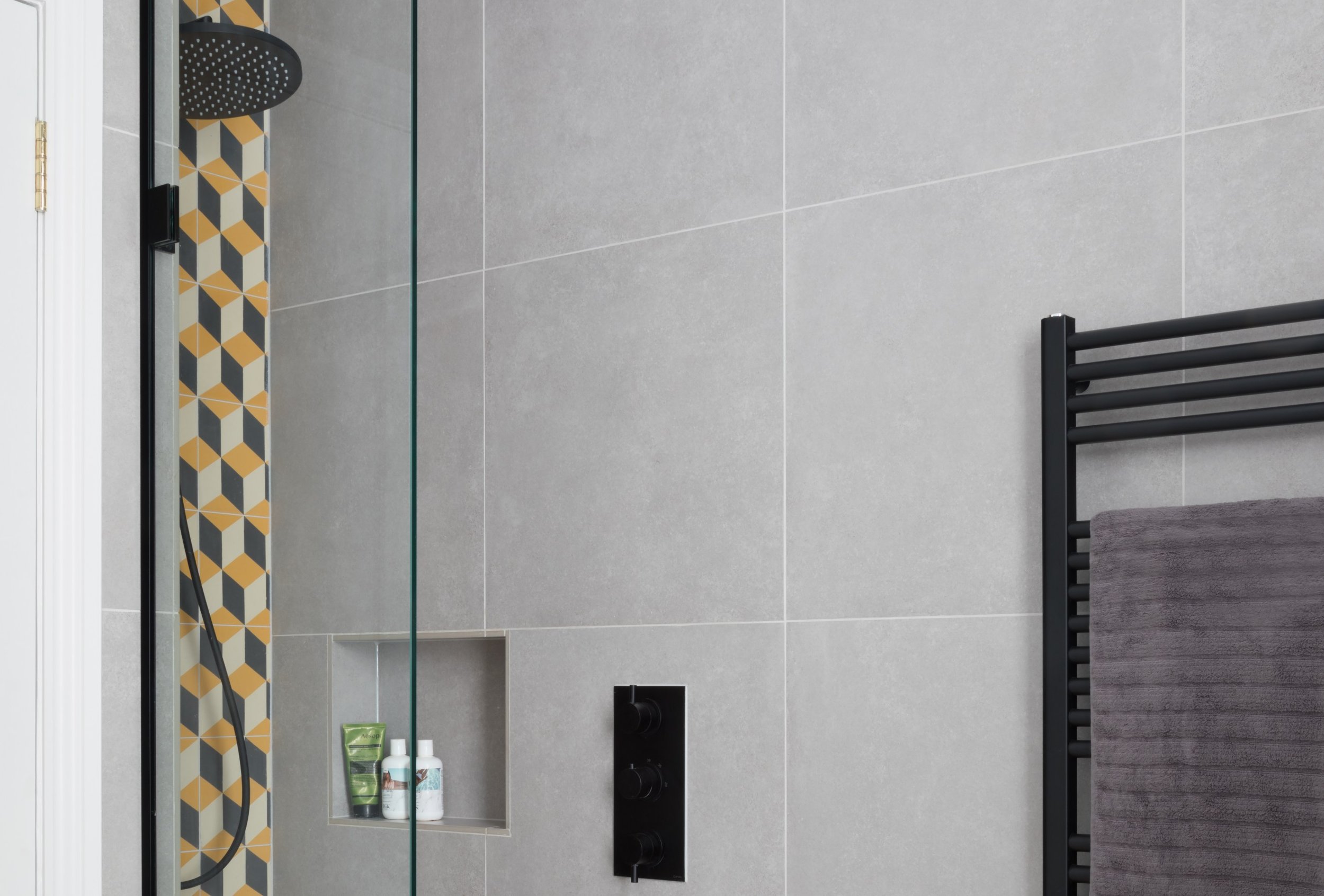
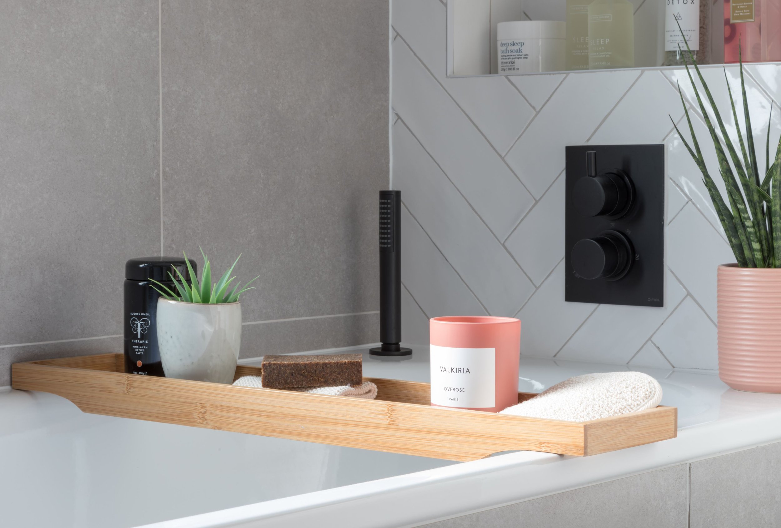
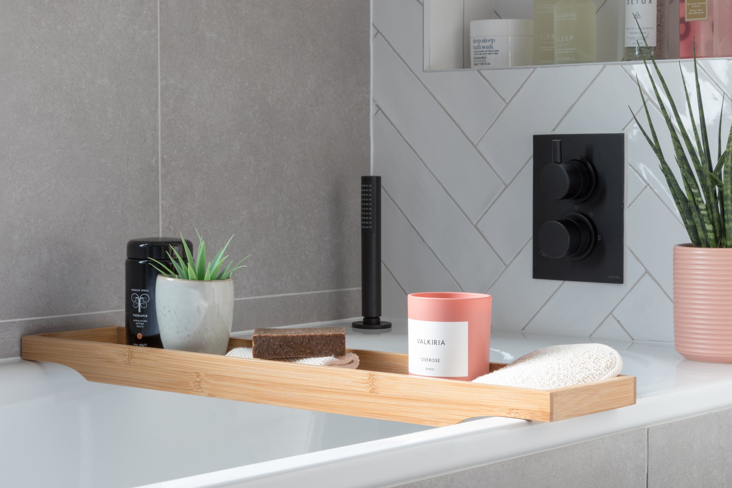
As a lifestyle and beauty vlogger, Lily needed her new bathroom to have plenty of storage space for stowing away products and samples. The new vanity unit features several deep drawers and the space between the unit and the floor offers the opportunity for additional storage baskets. Jo also incorporated storage recesses by the bath and the shower, providing easy-to-grab access bubble bath, shampoo and conditioner. However, the piste de resistance of storage solutions has to be the mirrored cabinet which has been cleverly built into the wall to create a deep storage space without any protrusion. The clever cabinet even features electricity charging points, so no need for unsightly shaver ports ruining the aesthetic of the room.
Even more storage was incorporated above the WC, not just for spare towels and bottles, but for a boiler! Lily’s boiler is neatly tucked away in a hidden cupboard above the WC, with a little extra space around it to stash away a few extra bits and bobs.
Time for tiles
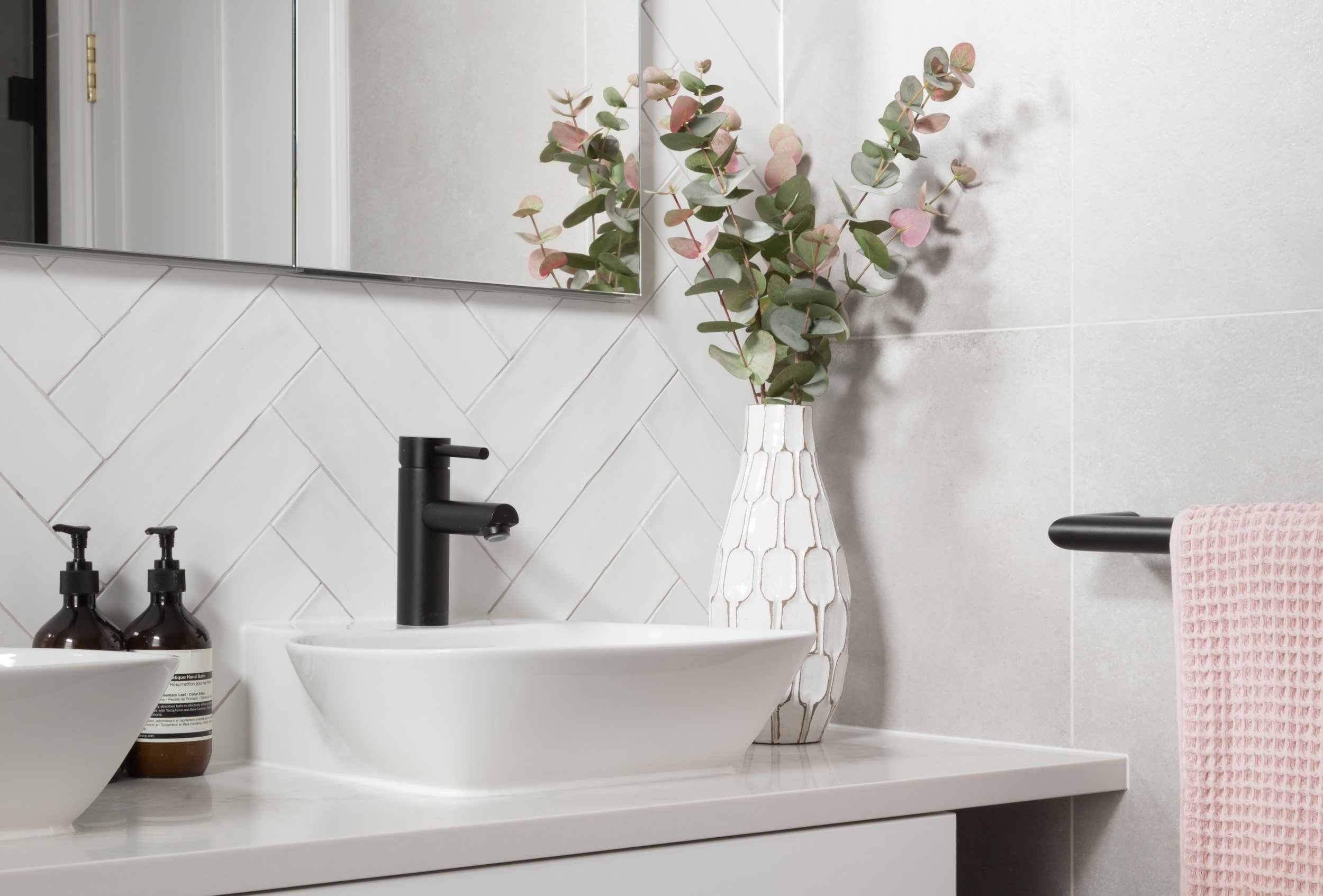
Lily fell in love with the large format grey tiles which reminded her of ones she’d seen on a recent hotel stay in New York. To create the illusion of a bigger space, the tiles were used on 3 out of 4 of the bathroom walls, as well as brought up the sides of the bath for one continuous finish. To break up the grey, Lily opted for a feature wall of gloss white metro tiles, formatted in a herringbone pattern to create additional interest. By using grey grout in the same shade as the grey tiles, the scheme ties together in a cohesive way and the contrast of gloss and matte textures work beautifully.
“We really wanted a layout that would allow for a bath and separate shower, a decent amount of storage for all my products and space to fit a boiler that we couldn’t fit downstairs in our kitchen. I wanted the bathroom to feel modern and clean, and I’d been inspired by the greys and matte blacks I’d seen in a hotel room in Brooklyn.”
- Client, Lily Pebbles
The shower space
As the shower area is slightly hidden from view, this provided the perfect place for Lily to have some fun with her choice of tile. She opted for a bold, geometric cube design in shades of beige, navy and mustard yellow, which Jo paired with simple matt black brassware and minimalist shower glass. The choice of matt black brassware throughout the room adds the modern feeling Lily was hoping to create and pops beautifully against all 3 tile types in the room.
Sanitaryware
Lily decided to take modern to the next level with her choice of WC. She opted for a shower toilet which cleans you with water after use. Complete with its very own remote control, the settings on the WC can be tailored to the user...creating a unique experience in every way! The room was completed with simple white matching basins, a matte black heated towel rail and plenty of stylish finishing touches.
The details
Location: London
Designer: Jo, Ripples London
Price: From £17k
Products: Gloss white metro tiles, recessed mirror cabinet, matt black brassware, wall hung WC, cube design tiles.
We love the versatility of herringbone metro tiles. Take a look around this compact cloakroom which uses gloss metro tiles to make the space feel more spacious.
For advice, tips and tricks from our team of specialist bathroom designers, download or request a copy of our free Style Guide.


