Case study: Spacious hotel-inspired master ensuite with dressing table area
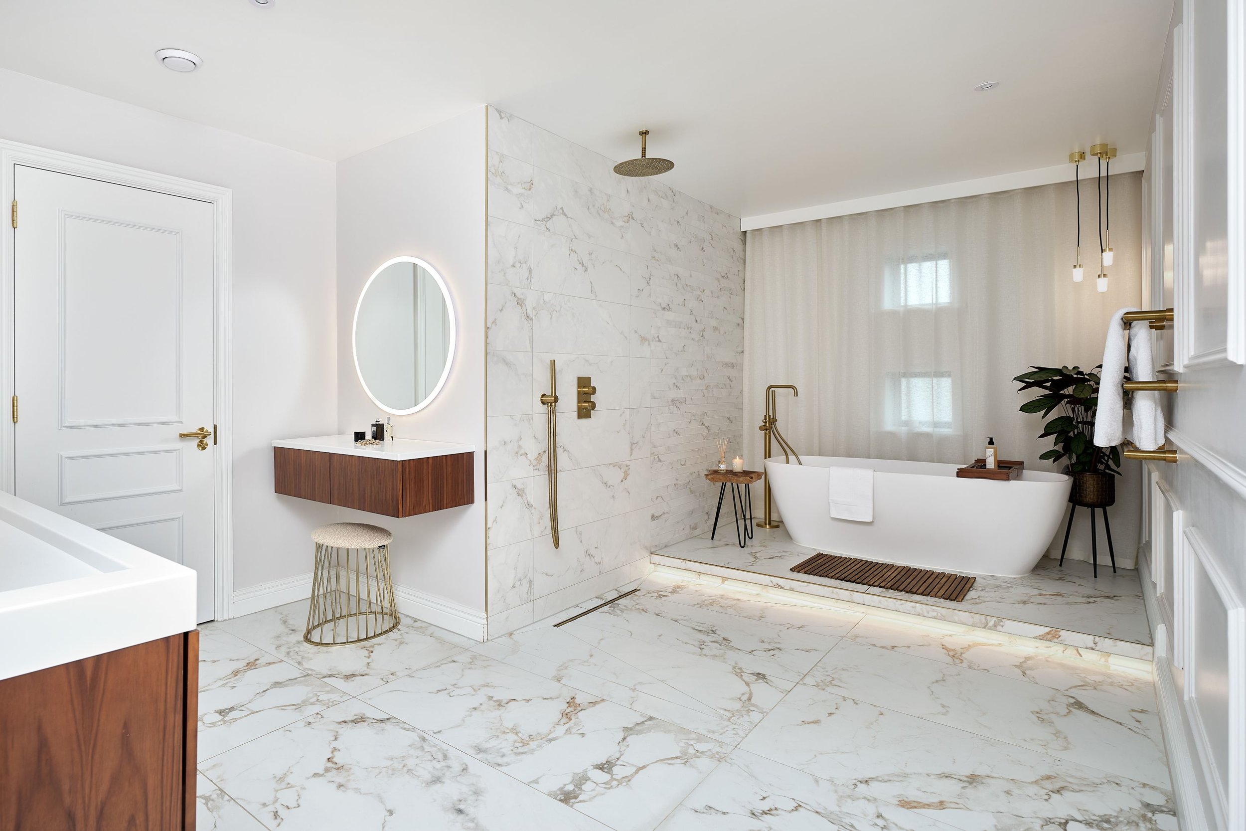
This breathtaking ensuite is a one-of-a-kind project which features a freestanding bath, walk-in shower and separate dressing table area.
Caroline Greig, Designer at Ripples Winchester was tasked with transforming this large space into a warm and welcoming master ensuite for her contemporary-loving clients.
The brief
The owners of this new-build home on the Southampton waterfront were looking to create a hotel-inspired master ensuite with the wow factor and worked with Caroline, Designer at Ripples Winchester to bring their vision to life.
The layout
The overall feeling of this home is one of space and the footprint for this en-suite was no different. The room sits at the back of the house and is accessed from a walk-in wardrobe which leads on from the master bedroom. Caroline’s clients were keen to maintain the feeling of openness but wanted to ensure the space didn’t feel to stark or cavernous, so, to maintain the flow of the house, they decided not to put a door on to the bathroom and to keep it as an extension of the master suite. As she had a lot of space to play with, Caroline was able to create a separate WC room with its own door and use the rest of the room to create that hotel-inspired look.
The bath
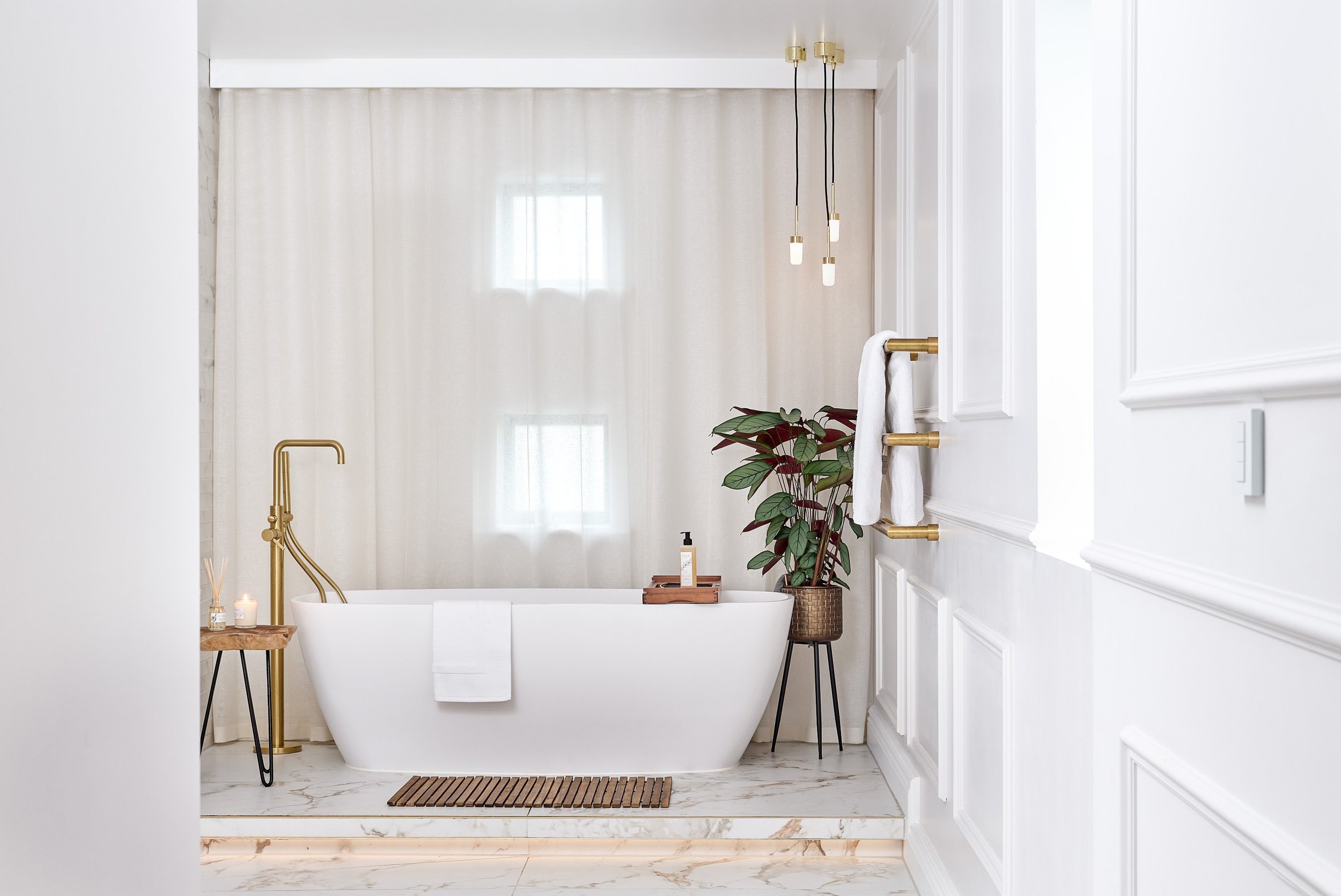
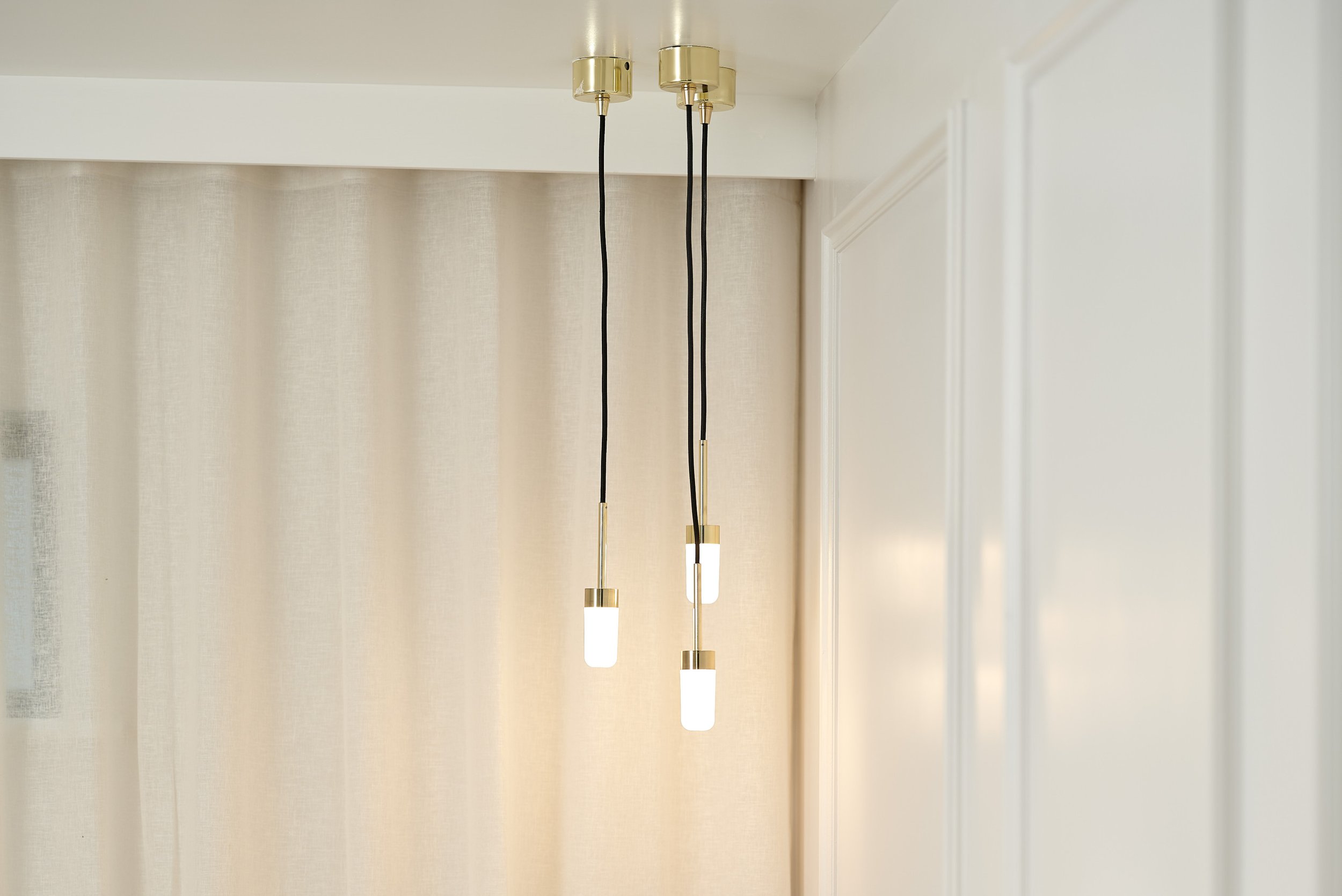
With the remaining space, Caroline decided to create specific zones, so each element within the room had a distinct purpose. The first part of the room she designed was the bath area and she decided to incorporate a platform with in-built strip lighting to highlight the different levels. The platform helps create a focal point of the bath and breaks up the expanse of floor tiles. Caroline’s clients opted for a modern freestanding bath to fit their sleek contemporary scheme. This area was then finished with a floor-standing brushed brass bath mixer and hanging pendant lights with gold detailing to add the touch of luxury the clients were looking for. The sheer curtain behind the bath softens some of the angular lines and finishes the area off beautifully.
The shower
To continue the boutique hotel theme, Caroline designed a walk-in shower area in front of the bath. The shower is really minimal in its design, so it doesn’t detract from the focal point of the bath, but is still a luxurious statement in its own right. With matching brushed brass brassware, it ties both the shower and bath zones together, creating a cohesive look.
“This was a dream project for me but it wasn't without its challenges! The trickiest part of working with such a large space is making sure it doesn’t feel too sparse. We achieved this by zoning the room to create distinct areas, whilst retaining the open-plan feel.”
-Caroline, Designer
Finishing touches
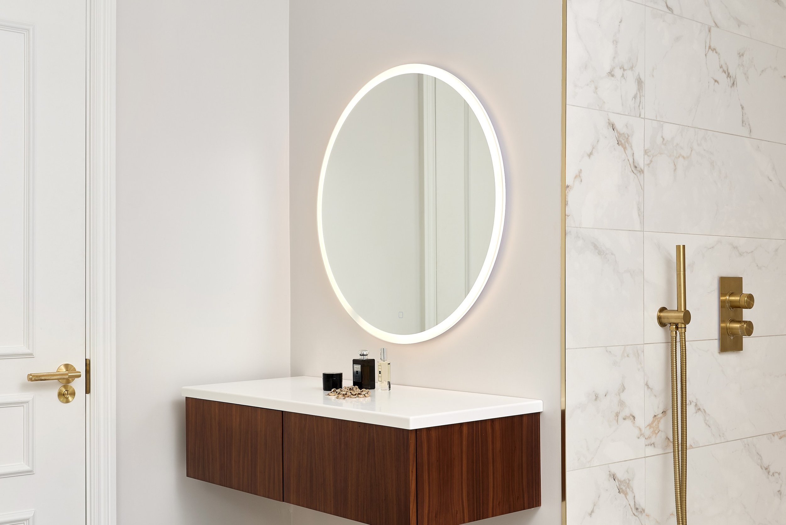
Caroline’s clients loved the idea of warm, earthy colours and finishes but with a luxury twist and she was really able to achieve this within this project. Caroline picked a beautiful marble-effect tile for the floor, complete with a golden-brown veining, to strike the perfect balance of earthiness and opulence. Due to the large amount of space available, Caroline needed a bespoke vanity unit and basin to fill the space and she chose a chestnut wood finish to bring that warmth and earthiness that her clients were looking for. The basin has a sleek minimalist design which matches the aesthetic of the room and brushed brass taps were chosen to match the rest of the brassware. On the opposite side of the wall, she mirrored the look of the basin area with a double vanity unit with matching Corian top, to create a small dressing table. This area was the finished with a round LED illuminated mirror, making it the perfect spot to get ready in the morning or to provide an additional lighting source in the evening.
The details
Location: Southampton
Designer: Caroline, Ripples Winchester
Price: From £20.1k (not including installation)
Products: Bespoke vanity unit, modern freestanding bath, marble-effect floor tile, brushed brass brassware, pendant lights.


