Case study: A contemporary compact bathroom with clever design tricks
This bathroom may be small in size but it packs plenty in, with a freestanding bath, walk-in shower, vanity unit and built-in storage.
The layout
With its small footprint and wishlist of bath and separate shower, The designer at Ripples Bournemouth, used a variety of space-saving design details to maximise its impact and practicality. Now the space is elegant, on-trend and multifunctional for both bathing and showering.
This five-bedroom detached house in Poole, Dorset, desperately needed some creative thinking when it came to redesigning the bathroom. Its compact size also presented the challenge of a sloped ceiling in two corners so the solution would need to incorporate plenty of space-saving ideas that would make the most of every inch.
The designer, from Ripples Bournemouth, took the task in their stride, creating a calming sanctuary with a wow factor tiled wall with recessed storage, a walk-in shower with fold-back screen, wall-hung furniture with statement concrete basin and lots of feature lighting to highlight storage niches and furniture, creating a calming ambience both day and night.
Freestanding bath
The freestanding bath, which sits in front of the window, is a sculptural statement tub perfect for a long soak at the end of the day. Its elliptical shape is made from a white composite material, which is strong, durable and easy to clean. The freestanding bath/shower mixer in brushed brass stands elegantly at one end and allows for double-ended bathing and hair washing.
Walk-in shower
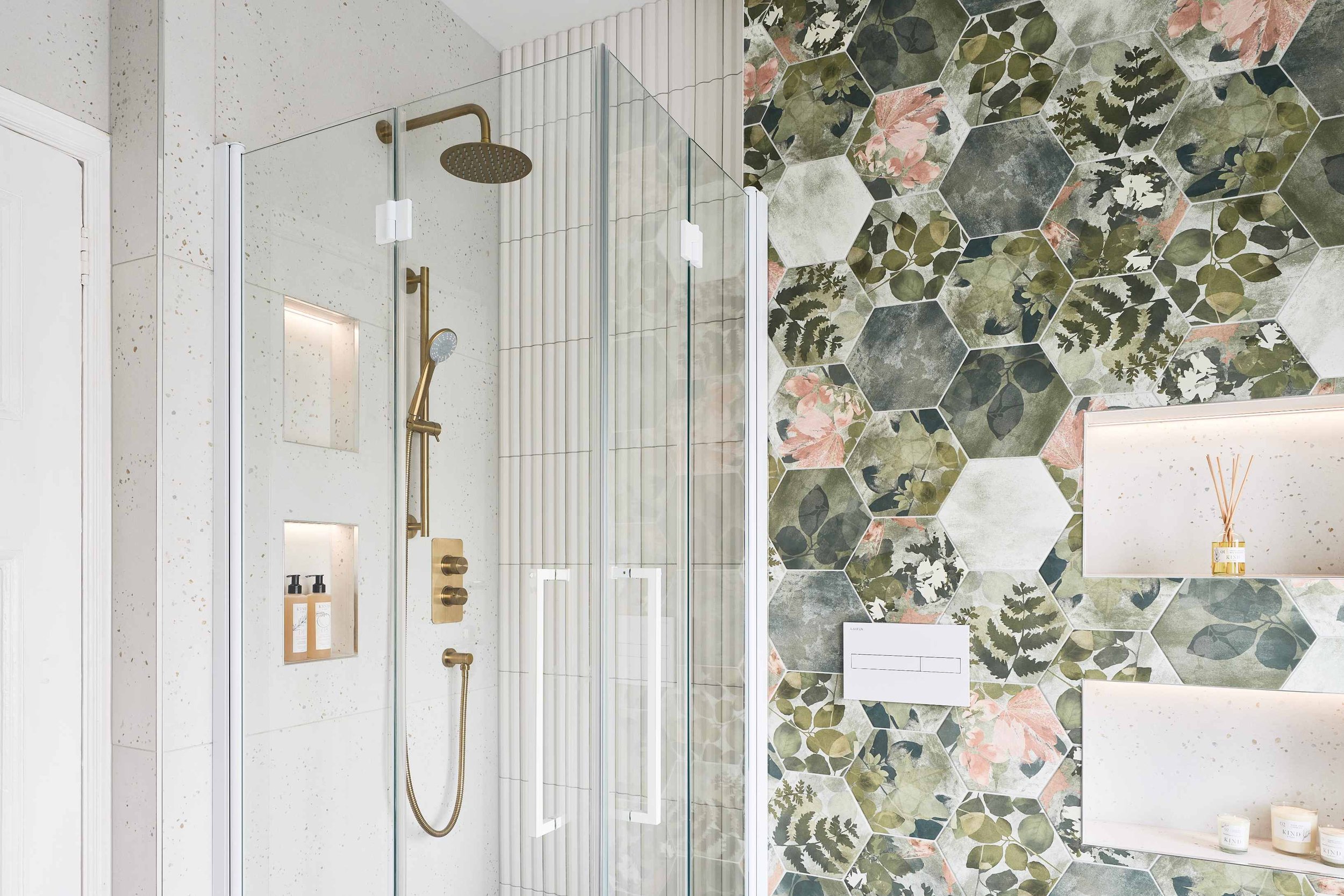
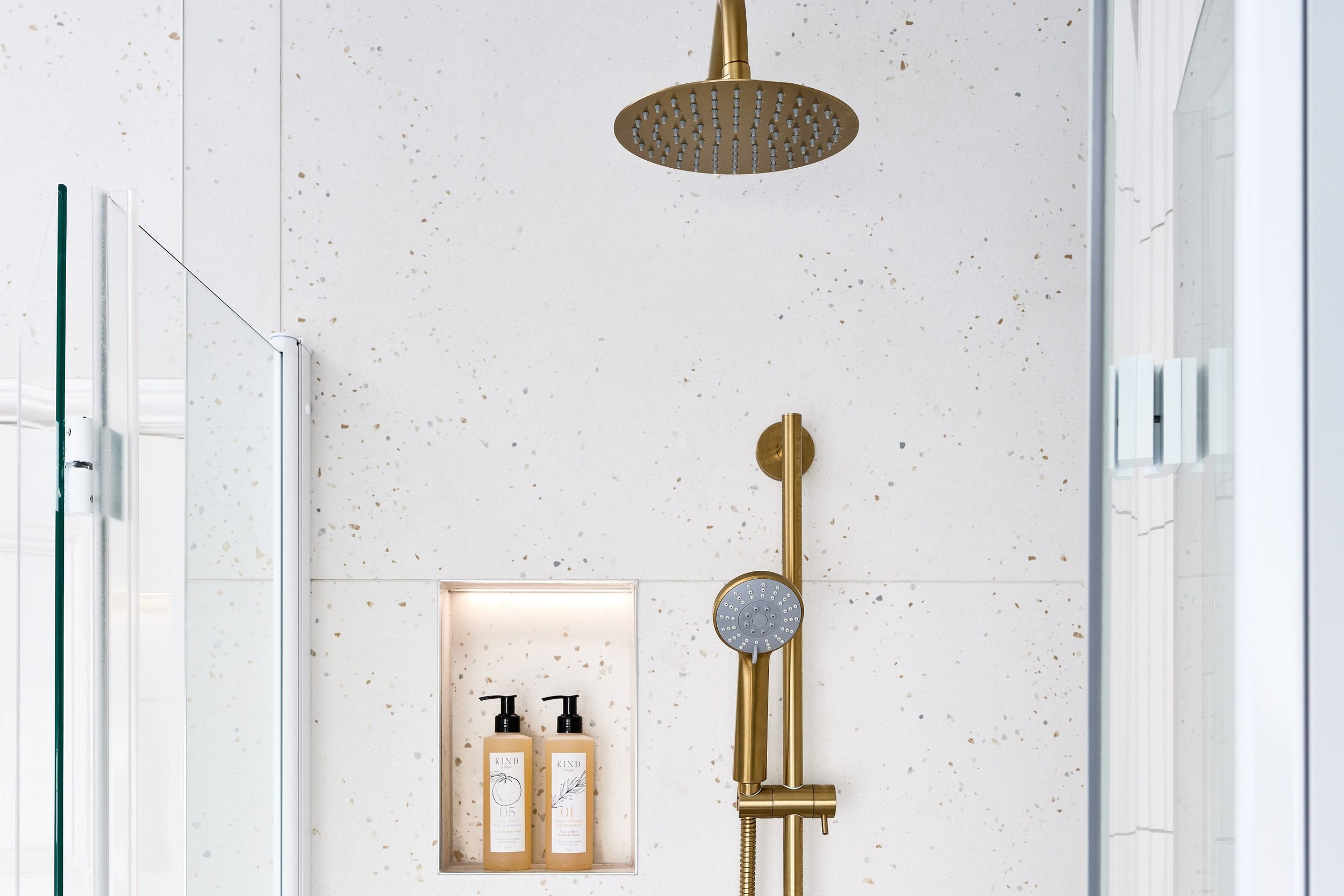
The owners wanted the option of showering as well as bathing, so the decision was made to create a luxurious walk-in design that features a fold-back shower screen to save space. The brushed brass shower includes a fixed showerhead as well as hand shower to complement the bath/shower mixer while ribbed and fluted white tiling helps to bounce light around the area, enhancing a feeling of space. The shower area also includes two recessed shelves set within the terrazzo-effect tiles for shampoo and shower gel. Adding feature lighting within brings a touch of hotel chic to the space as well as being a practical solution to highlight showering essentials.
“The statement bath and large walk-in shower have really elevated this bathroom into something special. As well as being ultra-practical for the whole family, it’s also now a space to relax and unwind after a long day.”
-Ripples Bournemouth Designer
Wall-hung furniture
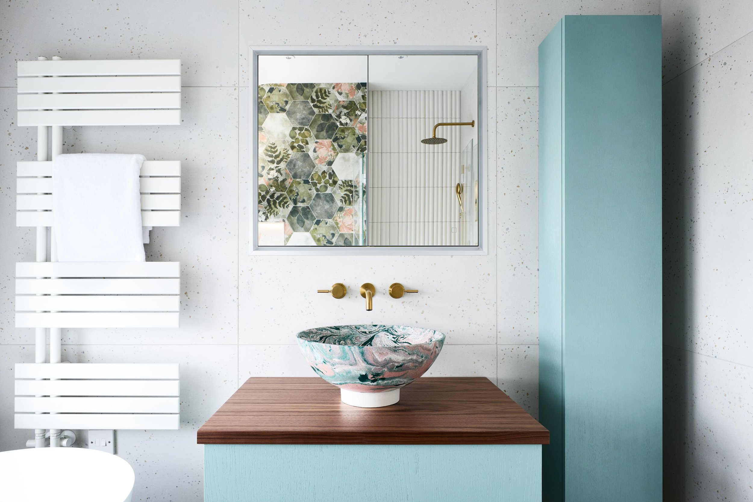
A great way to make the most of space in a small bathroom is to choose wall-hung furniture. It frees up the floor area, which creates a feeling of space as well as being easier to clean. A matching vanity unit and tall cabinet was chosen for this scheme in a soothing aqua tone with a wood grain top for the vanity to match the wood-effect porcelain floor tiles. Feature lighting beneath the furniture adds brightness on a dull day while an in-built mirrored cabinet is another clever design trick, which is both practical as well as space-enhancing, reflecting the room to make it feel instantly larger.
Concrete basin
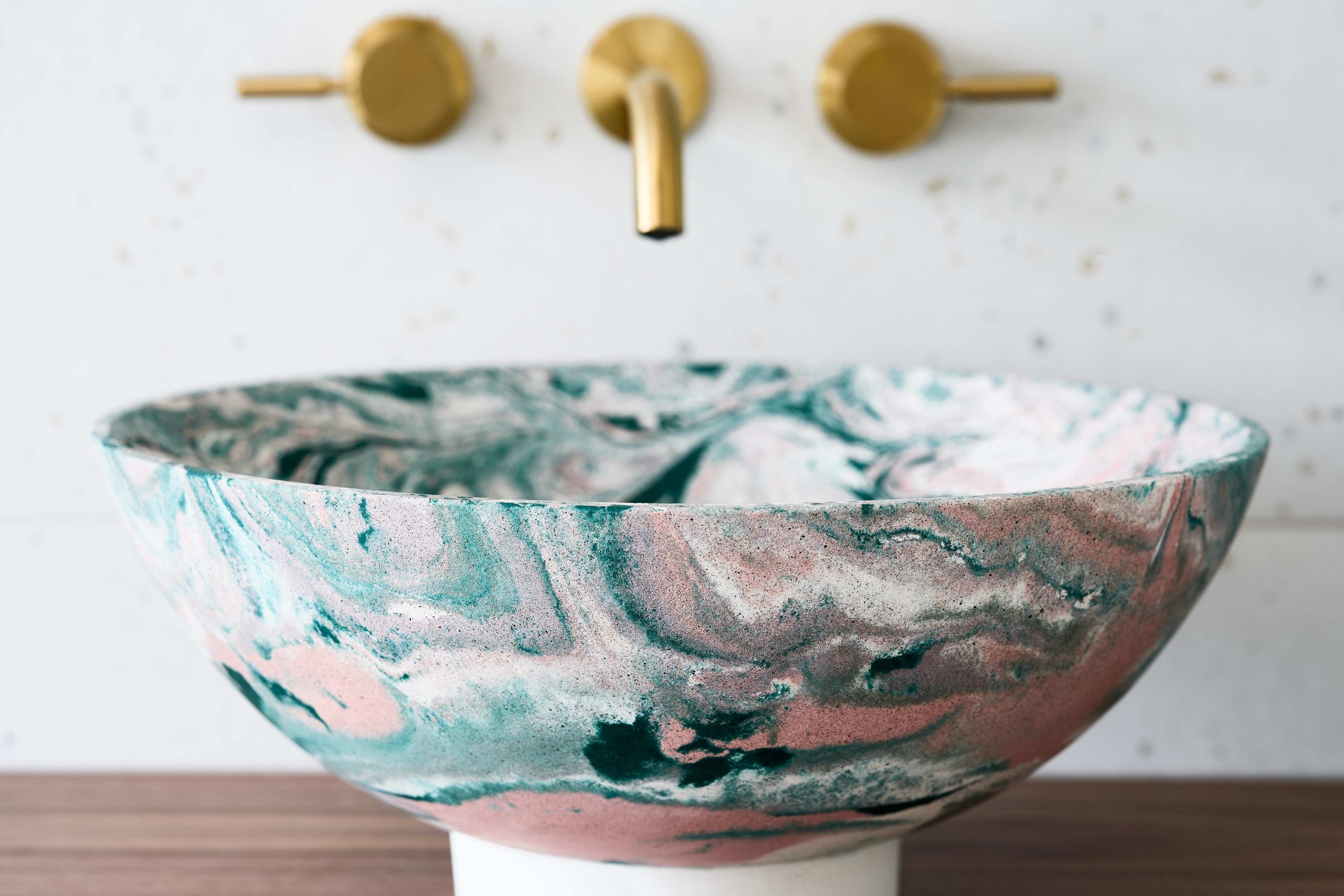
Another statement piece within this scheme is the countertop concrete Whirligig basin by Sam Lander. Sam’s handcrafted basins are made by pouring coloured concrete into a mould within a purpose-made machine that spins rapidly, creating enough centrifugal force to mix the concrete and push the mould up and out, forming the basin shape. Each and every basin is unique and the marbling effect of this piece is right on trend. Andrea paired it with wall-mounted basin mixer in brushed brass to match the bath/shower mixer and shower.
Recessed shelving
As well as inside the shower area, a built-in recessed shelving was designed within the feature wall of National Trust botanical porcelain tiles behind the rimless wall-hung WC. These storage niches are clad with terrazzo-effect tiles to tie the scheme together while the backlighting enhances a feeling of light and space while also providing a relaxing feel when bathing during the evening. The shelving is perfect for candles and diffusers, giving this bathroom a spa-style feel for unwinding and pampering.
The wall of hexagonal tiles brings a sense of the outside in, as their botanical National Trust print features a random mix of leaves, ferns, flowers and petals with a soothing green and pink palette that complements the rest of the room perfectly. The designer also selected a rimless WC, which is wall-hung to free up the floor area and enhance a feeling of space while the white flush plate matches the crisp white finish of the bath and WC.
The details
Location: Poole, Dorset
Designer: Ripples Bournemouth
Price: From £15.2k (not including installation)
Products: Freestanding bath, brushed brass brassware, concrete basin, wall-hung furniture, wall-hung WC
For advice, tips and tricks from our team of specialist bathroom designers, download or request a copy of our free Style Guide.
Do you want to transform your en-suite into a light, bright and luxurious room? Take a look at our Scandinavian inspired bathroom for a recent client.


